CALMNEST
Branding | Logo Design | Business Cards | Stationery
Calmnest is a wonderful new business, working as a sleep consultant, helping families improve their children's sleep! I was delighted to work with a business that offers such a fabulous service, creating their full visual identity.
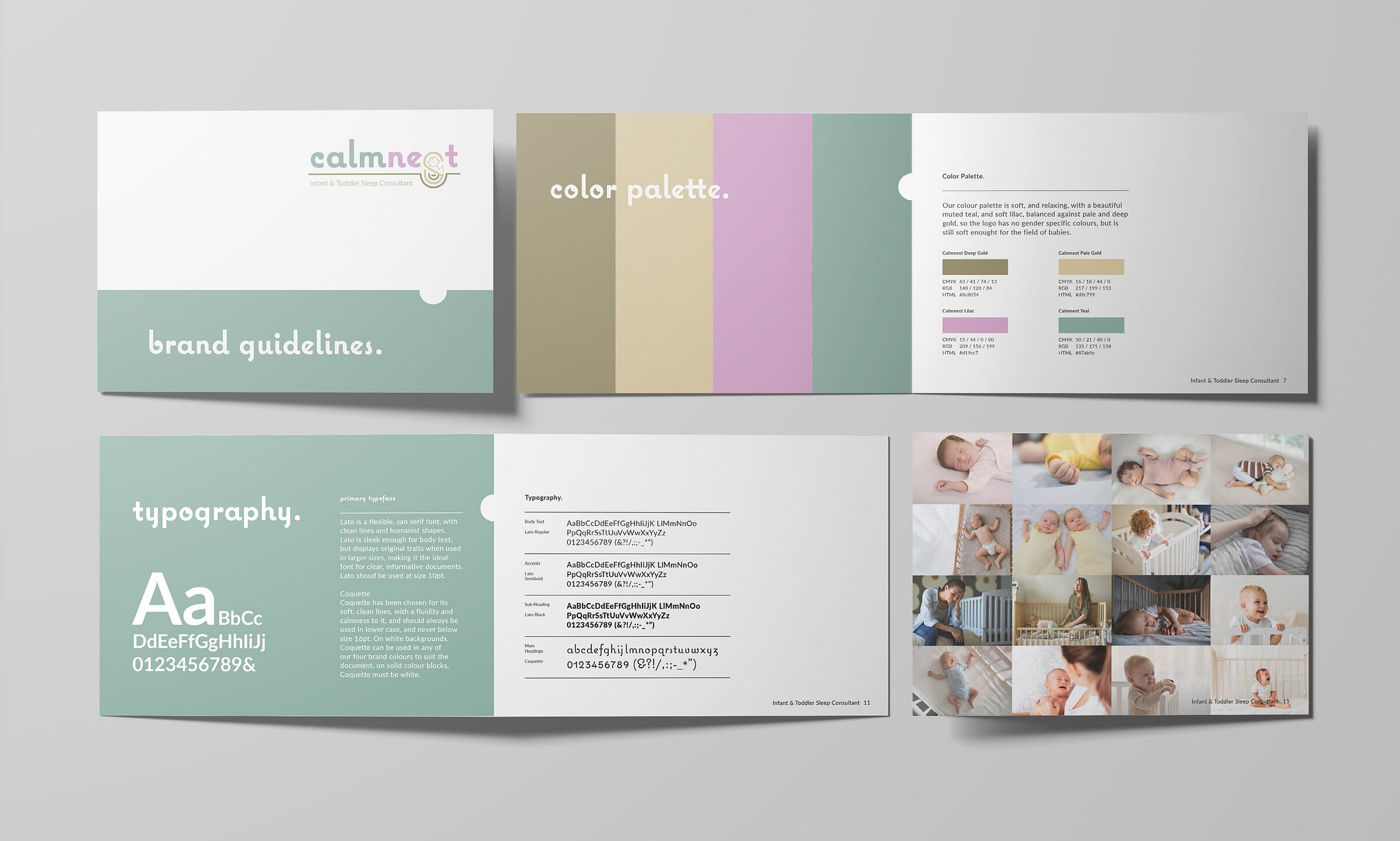
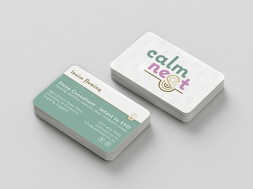
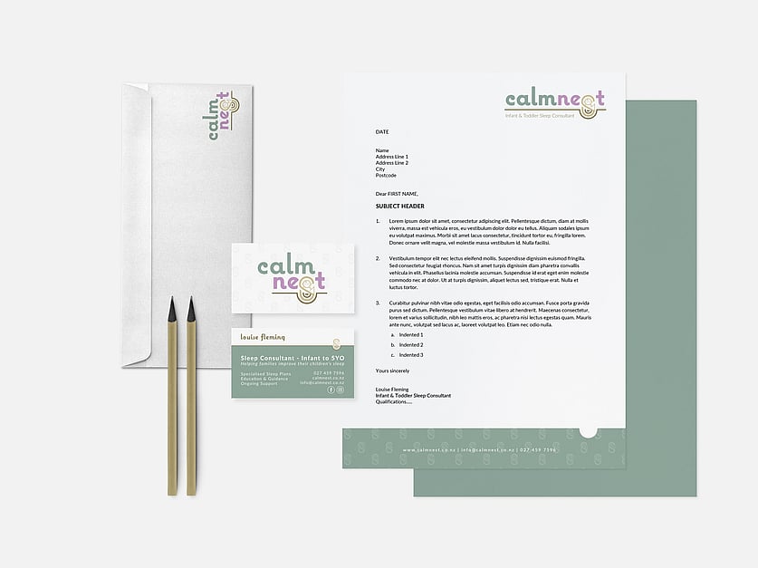
Calmnest’s logo has been carefully curated to represent softness, nurturing and clients who are parents and babies who need the services she offers. The logo plays on the name with a nice, swaddled and calm baby, sleeping in a nest. The baby is also a play on an egg in the nest, with the shape and colouring, and as a swaddled baby, lends itself to our philosophy and teachings.
I chose a colour palette that is soft, and relaxing, with a beautiful muted teal, and soft lilac, balanced against pale and deep gold, so the logo has no gender specific colours, but is still soft enough for the field of babies. The brand elements tie the branding together and give a professional cohesive look.
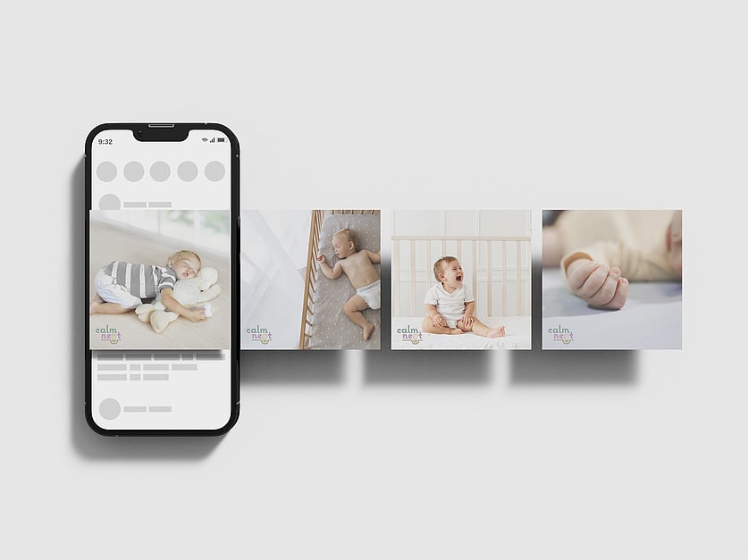
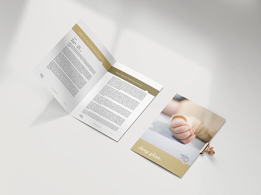
The images I sourced reflect both safe sleep practices, as well as images such as crying babies, toddlers getting out of cots which respresent the core demographic - parents who are struggling with getting their child to sleep. The images utilise a very clean, very neutral palette, with the occasional pastel pop of colour etc. to tie in with the branding.
I made a full visual identity package, taking them through the whole process from concept to delivery, with the complete suite of assets including:
Logo
Colour palette
Branding guidelines
Sourcing imagery
Social Media templates
Business cards
Booklets